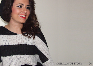
Firstly, I picked out a suitable photograph from my photoshoot. I chose the following picture as the model is facing the potential text, giving a unity between the text and the image. The image adds to the mode of address, giving a connection with the audience almost as if the star is talking to the reader.


I added my photo to photoshop, along with the title of the story and the page name. I kept the background plain again, keeping aspects of my colour scheme yet a little different.
Next, I wrote my story. I used a quote from the celebrity and placed it in the text in bolder fonts to make it stand out and give the story more character making it look more interesting for the reader. I alligned the text to the centre, so it looked even. However, this created some problems as some words and letters were too spaced out. Time played a main part during this project and if there was more of it, I would have went back and corrected this problem but I felt there was more important things to correct.
Finally, I added finishing touches to my page. I wanted more elements of my colour scheme bought into it to make the magazine look more professional, therefore I placed a 'kiss' picture underneath the page number and put a large red letter "C" behind my text. The letter C is relevant as it is the start of the artist's name that the story is about.
I also added a line between the title and the article as I thought the two pieces of texts needed breaking up.
I also added a line between the title and the article as I thought the two pieces of texts needed breaking up.


No comments:
Post a Comment