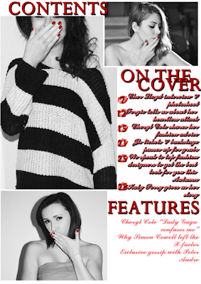
Taking the same font and red colour from my front cover, I began to produce my contents page. From using similar elements from another page in my magazine it begins to give my magazine a house style making it look more professional. I coloured my pictures in black and white to give a little twist on the page. However, I felt I should keep some of the colour scheme, so I therefore chose pictures that all showed nails and I then coloured the nails in with red using photo shop.

I then began to add the subheadings on my front cover, onto this page. I featured the "lips" picture from my front cover and placed them behind the page numbers. I did this because it added a little more colour and then also related back to my front page. After I'd finished including articles from my front cover, there was a little bit of space at the bottom so therefore I invented some more pages and included them under the title of "Features". My contents page was nearly finished.
I felt that the titles didn't stand out enough, like the headings on my front cover. I solved this problem by adding thin boxes behind the titles, identical to the front cover ones. I then added two final "lip" pictures to then finish my contents page.


No comments:
Post a Comment