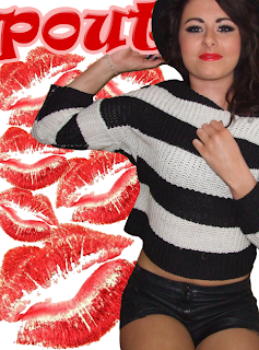
Finally, I decided this would be the final design for my title. I like the 3d effect I put on it, I feel that when placed on my magazine it will make it stand out more in comparison to other elements on my magazine. Also, the curves and the puff make it seem quite childish, attracting my target audience. The baby pink outline also reflects youth and adolescence.

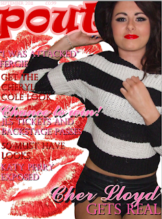
Putting the title onto my front page, I added the cut-out cover star and filled the plain white background with pictures of lips. I used these pictures as I felt it associated with the title meaning, as well as using the same colour scheme as the title too. When I first added the picture of the cover star, it covered the majority of the title. Although I felt this looked presentable, it would be difficult for the audience to read what the title says. Therefore, I solved this by putting the models hat infront of the title and the hand behind it. This way the title and the coverstar both stand out without making the font look unrecognisable.

For my next step I added subheadings which were little hints that would potentially be featured inside of my magazine. I still used the colours red and pink but added a black shadow to them because if I didnt do this, the text wouldn't have been easy to read and wouldn't grab the readers attention as much.


No comments:
Post a Comment