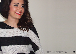
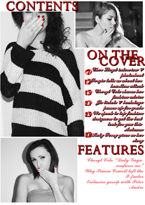
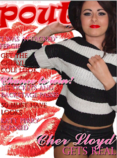
My magazine includes basic conventions such as a main image, associated with my genre, a barcode, a masthead, coverlines and the magazines date and price. Using all of these elements it makes it easier for the audience to recognise my work as a magazine. These conventions have all been made to suit my magazine genre, such as colour schemes and an appropriate photograph. My masthead is bold, with a lightly coloured outline to make it stand out even more. By having a bold masthead, it should immediately grasp all attention from my desired audience, making them want to pick up the magazine or making the magazine easily recognised. I challenged magazine conventions in my own way. I kept including a signature picture (lips) throughout my pages in my project. This would also help readers identify my magazine. I thought this idea was quite adventerous compared to other magazines. In my double page spread and contents I have also used this generic symbol underneath page numbers. The majority of double page spreads in magazines have the models facing the text, making it more friendly for the audience as it makes it seem that they are actually directly talking to you. I have used this convention in my double page spread, as I felt it worked effectively.
My magazine represents social groups such as students. Students that tend to look up to different celebrities and see them as role models. The main thing that would attract this particular social group would be the fact the cover model is young, famous and predominently a role model to a variety of teenagers. The magazine is modern, including elements such as bright colours, pictures of the latest "celebrities" and recent gossip.
I think that the media institution "IPC Media" would be distributing my magazine. This is because they print similiar magazines to mine, and the majority of their target audience is females. My magazine would fit into a pop catorgory in shops such as WH Smith, along with plenty of other similar magazines. I feel that there isnt as much competition in the pop music In addition to my magazine being put onto a shelf in a shop, I think it would be a good idea to create a website for it. This is much more up to date and the majority of magazines have already done this, allowing you to download it to your computer when the magazine is issued in shops.
My magazine is aimed at a typical teenage girl, aged 10-16 interested in typical teenage activities - pop/chart music, celebrities, boys, fashion etc. Although the magazine attracts mostly girls, you could argue that it may also appeal to boys who are interested in the previous list. The price of the magazine is reletively low to fit the teenagers set "pocket money" still being issued by their parents. Also, the language used throughout the magazine is fairly recognisable to this age group, using easy vocabulary and not too complicated for them to understand. I felt that the target audience was fairly popular in the industry therefore it was a challenge for mine to stick out to the desired people. To attract my audience I used obvious popular colours, such as red and pinks. The connotations of these colours immediately remind me of girls who are perhaps still in their youth. I also used bold fonts and sometimes lighter backgrounds behind the fonts to make the text stand out more. I feel that the colours could grasp the audiences eyes, and making it bold makes it much easier to read if it was just to be glanced at. Modelling the cover star to directly look at the camera immediately addresses the audience, it feels as if she is looking into the audience's eyes. By doing this, in comparision to a model looking away from the camera, it attracts the audience member in. If I were to go back and re do the photograph I think I would take a closer picture, a medium close up shot. This is because the features of the model would be clearer and wouldn't be uncomfortably close.
My magazine is aimed at a typical teenage girl, aged 10-16 interested in typical teenage activities - pop/chart music, celebrities, boys, fashion etc. Although the magazine attracts mostly girls, you could argue that it may also appeal to boys who are interested in the previous list. The price of the magazine is reletively low to fit the teenagers set "pocket money" still being issued by their parents. Also, the language used throughout the magazine is fairly recognisable to this age group, using easy vocabulary and not too complicated for them to understand. I felt that the target audience was fairly popular in the industry therefore it was a challenge for mine to stick out to the desired people. To attract my audience I used obvious popular colours, such as red and pinks. The connotations of these colours immediately remind me of girls who are perhaps still in their youth. I also used bold fonts and sometimes lighter backgrounds behind the fonts to make the text stand out more. I feel that the colours could grasp the audiences eyes, and making it bold makes it much easier to read if it was just to be glanced at. Modelling the cover star to directly look at the camera immediately addresses the audience, it feels as if she is looking into the audience's eyes. By doing this, in comparision to a model looking away from the camera, it attracts the audience member in. If I were to go back and re do the photograph I think I would take a closer picture, a medium close up shot. This is because the features of the model would be clearer and wouldn't be uncomfortably close.
The main element from this project that I have learnt succesfully would be the use of photoshop. I now understand basics that can make a dramatic effect on my work. I worked with tools such as photo editing - learning to remove imperfections and airbrushing skin, changing colours, brightness and saturation throughout my images making them look suitable for my magazine and also very professional. Without experimenting with this program through this project, I also would never have learnt to make my text stand out in such a way that looks slick and still does the job of grabbing the audiences attention. Drop shadows, outlines, colour overlaying etc all helped me to find the perfect text.
I feel that there is a very big contrast between the college magazine task, and the task I have recently completed. Firstly, my photoshop knowledge was no where near as professional back then compared to the knowledge I have now. Throughout the period of time between the two magazines, I have learned the ins and outs of photoshop producing beginner yet excellent pages for my magazine. Although my photoshop skills weren't as brilliant in my preliminary task, I still had a rough idea of conventions I should be using and therefore this helped me create what should look like a magazine. I felt that the magazine I had previously made only had a basic structure to it, and the audience wouldn't be as attracted to it because of how plain it was. To try and overcome this problem, in my music magazine I tried to add different elements such as broad mastheads and powerful colours. I feel that I suceeded in this magnificently.


